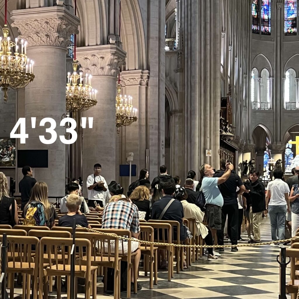
I made a recording of 4’33” in Notre Dame, and even when I edit it to 4:32, it is showing up as 4:34 seconds long. Well, I will not use the computer to deceive you with an incomplete performance. You deserve the entire 4’33”, and that is what you get.
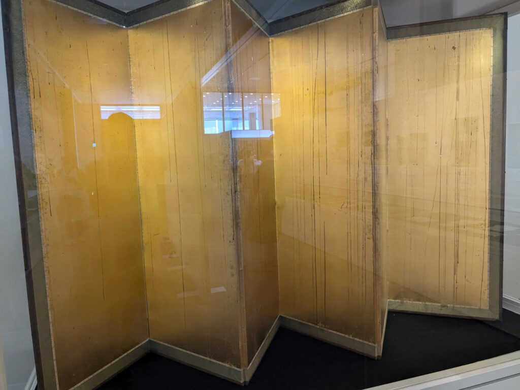
Gold folding screen [kinbyoubu, 金屏風] at the Hiroshima Peace Memorial Museum in 2024 photo: @bbhilley.bsky.social
“There is a six-panel folding screen, donated just recently by a Hiroshima family, whose gold expanses are streaked by black rain: the most terrifying abstract painting I have ever seen.” So wrote Jason Farago in the New York Times, after visiting the Hiroshima Peace Memorial Museum before the 80th anniversary of the US nuclear bomb attacks on Hiroshima and Nagasaki.
But then I realized we were all exactly wrong. This is not a painting, and most importantly, it is not abstract. The way we immediately read it as such, though, underscores Farago’s larger point, which is that we largely lack the cultural references needed to recognize this object, where it came from, and why it’s as urgent to understand it now as it’s ever been.
This specific error is worth chasing down. The screen does not look like an abstract painting; abstract paintings look like it. Which is itself an overwhelming realization, until it isn’t.
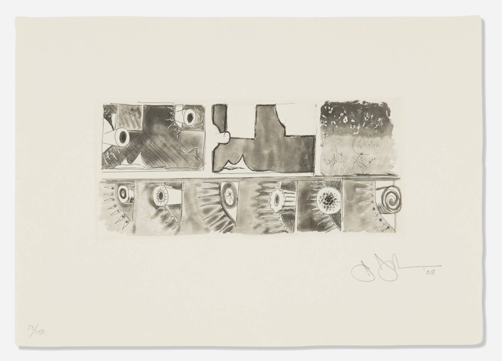
Jasper Johns, Untitled, 1992, intaglio & aquatint, 43 1/2 x 53 1/2 in., with little guys in the vase, via WAC
You’d think I’d have taken the hint sooner. Like after seeing the big jump around 2001 of appearances of the three little, brush-wielding stick figures in Jasper Johns drawings—because they were in the prints he was reworking. Or after finding little guys gazing at the stars in the 1997 etching he made for Leo Castelli’s 90th birthday portfolio.
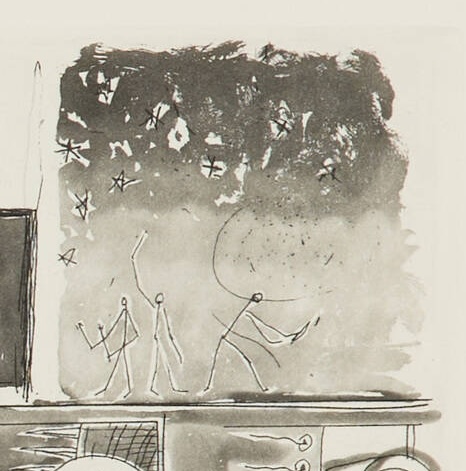
But no, it took finding little guys in Johns’s 2008 Artists for Obama print that made me realize there was much I didn’t know about Johns using the little guys motif in his prints. And it turns out they’re all over the place. Johns is a printmaker who paints, and his imagemaking crosses mediums with the ease Canadians used to have crossing the US border. So I was missing a big part of the little guys story.
Jasper Johns, Untitled (from the Artists for Obama portfolio), 2008, etching and aquatint, 8 x 20 cm image, 21 x 30 cm sheet, ed. 13/150, selling as a loosie on 3 Sept 2025 at LA Modern [kinda wild that such a low edition number was broken up for parts]
Whoops, missed another one. I might have to check all the benefit print portfolios Johns contributed to in the last 30 years, to see if there are any more little guys out there.
Meanwhile, these little guys are in a little print—just 8 x 20 cm, smaller, even than the Ellsworth Kelly print in the same Artists for Obama portfolio.
Jasper Johns, detail, Untitled (from the Artists for Obama portfolio), this little scene is like 5 x 5 cm
And they’re pretty lyrically drawn, too. No stamps here. I assume those are pens in their hands, encouraging people to register to vote.
After decades of tearing down medium-specific silos I’m not going to start rebuilding them now. And it’s entirely reasonable to look at Wolfgang Tillmans’ wide range of print formats and say that he has always been exceptionally aware of making shows that are also installations, and images that are also objects.
But by the time I made my way through Tillmans’ massive, catalogue raisonné-scale show that fills the Pompidou’s 6,000 m2 library, the pictures all felt familiar. The music, I love that for him. What I wanted to know more about are Tillman’s sculptures—and his painting.
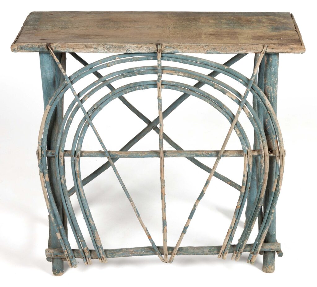
I have no place for an Appalachian twig side table in my house or my life, but I am woefully tempted to find a place for this one in my storage. Or in the trunk. Instead I am posting it here, so that I and you and everyone else can appreciate its elegant simplicity, and its details—like the notches in the top to hold those three twigs. And maybe bringing other peoples’ attention to it will thwart any notion I might have to impulse bid on it.
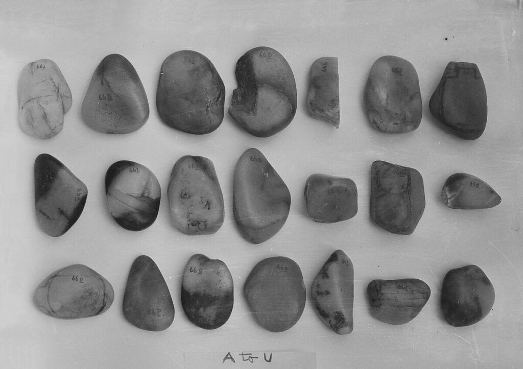
21 Pebbles, A to U, nephrite from the riverbeds of Khotan, China/Turkmenistan, in The Bishop Collection at the Metropolitan Museum of Art, via met museum bot [h/t @octavio-world]
In one sense, you really don’t need any more info than what is in the photograph. What you see is what you see: 21 Pebbles, A to U. Yep, checks out.
It was photographed, presumably in situ, at the East 66th St home of its owner/donor, Mrs Emma Sheafer, with a scraggly dark cloth behind it, tacked to the ceiling. In the 50 years since, the Metropolitan Museum has not felt the need to document it any further. And really, why mess with perfection? The Met in the 70s really was a golden age of show-the-museum-construct registrar photography while scooping up an entire collection. Very Thomas Hoving.
On the French Rivierea there’s a villa one hilltop over from Éze that has always blown my mind. In a place where everyone else’s houses and villas are built cheek-to-jowl, the Château Balsan sits on its own 70 hectare (172 acre) hill that drops to the sea (or to the railroad track, at least). It was built in 1920 by Consuelo Vanderbilt and her French second husband Jacques Balsan (thus the name, though they called it Lou Seuil), in collaboration with the landscape architect of Blenheim Palace (she’d been traded to the Duke of Marlborough by her mother).
In all the years I’d known about the house, I’d known about the Vanderbilt connection, but not anything of its current/latest owner. Until yesterday. Vanderbilt died in 1964, and by 1969, it was owned by France’s leading mall developer, Robert Zellinger [de] Balkany. That’s when married his second wife there, Princesse Marie-Gabrielle de Savoie, the daughter of the last king of Italy. Judith Benhamou reports that it was around this time he added the “de” to his name, and insisted on being addressed as Barone, though I don’t think that’s how defunct Italian titles work.
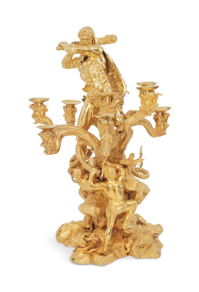
Anyway, he filled Château Balsan and his multiple other houses with extravagant furniture and objets, long after he and the Princesse divorced in 1990. This buck wild vermeil candelabrum, for example, he bought at Christie’s in 2004.
It was made for the Duke of York, King George III’s second son, in 1824, and depicts Hercules slaying the Hydra; each of its nine heads holds a candle. It stands 35 inches high, and is made from 35 kg of silver. It’s a baroque pastiche composition by Edward Farrell, the master silversmith at Kensington Lewis, who fed the Duke’s massive silver habit. Relatedly, it was first sold after the Duke’s death in 1827, along with all his silver, to settle his massive debts. Most of the stuff, though, including this candelabrum, ended up selling for less than a quarter of what it originally cost, which, combined with the death of his main client, kind of crashed Kensington Lewis’s retail business.
Anyway, ZdeB must have bought it after it failed to sell in 2004, because it is not listed. He died in 2015, and the candelabrum was the top lot in a 2017 700-lot sale of stuff from Paris and Éze, the fourth time it came up for sale at Christie’s. Not a lot of bangers; only 20 lots sold for more than GBP 100,000, but he made it up in volume, I guess.
It seems like the house remains in the family, though if it sold, it’d probably be the most expensive house in the world, and would sell to someone far worse than a mall developer.
Arthur Jafa’s 2022 exhibition at LUMA Arles was called LIVE – EVIL, like an impromptu Miles Davis recording. The catalogue documenting the show, though, is called EVIL – LIVE, which I guess is the opposite: a carefully crafted production that took years to realize.
I realized it was out in Arles several months ahead of its release in the US, so I yeeted myself over there to pick one up. There are three Jafa interviews, a grailcollection of his writings, and some choice essays.
Like an excellent deepcut essay by Julian Myers-Szupinska of Grupa OK fame about Jafa’s confounding appearance in the Whitney’s 2000 exhibition Bitstreams. All these years later, my mind has been reopened on that digital art show that left me bored and cold at the time.
installation view, Arthur Jafa’s 2021 show at Barbara Gladstone Gallery 64th St via BGG
And Liam Gillick goes long on Jafa’s wall-mounted metal sculptures, which are an alluring presence throughout the extensive photodocumentation of the massive Arles show. The Arles sculptures are larger and more architectural/structural than the similar works Jafa showed at Barbara Gladstone’s townhouse gallery in 2021. Those felt like Cady Nolands made from a different tool bin. Gillick, with some ambivalence, sees them primarily in relation to the Arles train sheds he helped gentrify. [ofc to the Cady Noland guy everything looks like a Cady Noland; to the extruded aluminum structure guy, everything looks like instant architecture.]
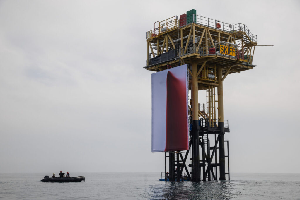
Greenpeace climbers install a major new work by renowned artist Anish Kapoor titled BUTCHERED onto a Shell platform in the North Sea – the world’s first artwork to be installed at an active offshore gas site.
After securing a giant 12m x 8m canvas to one side of the structure, the activists hoisted a high-pressure hose on top of the canvas at a height of 16 metres above the sea. They then pumped 1,000 litres of blood-red liquid that gushed into the fabric, creating a vast crimson stain.
The work is a stark visualisation of the wound inflicted on both humanity and the Earth by the fossil fuel industry, evocative of our collective grief and pain at what has been lost, but also a cry for reparation.
Greenpeace really do be preloading the whole story in the captions of their press release photos, I guess. The “blood-red liquid” used for Kapoor’s protest piece, Butchered, is made from sea water, beetroot powder, and non-toxic pond dye.
Does the painting belong to Shell now? Did they take it down after the photos? The status of the artwork beyond this media cycle is as unclear as the archival properties of Kapoor’s medium. But it does continue to be hot as hell here.
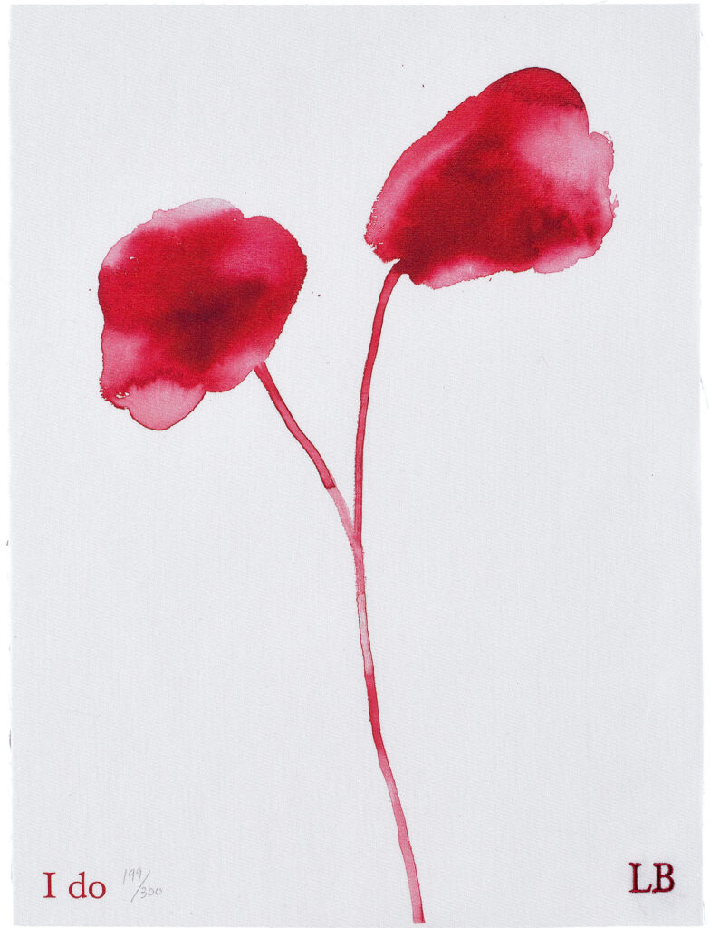
Louise Bourgeois, I do, 2010, digital print and embroidery on textile, 16 x 12 in.,ed. 199/300+35 AP, unframed, sold at Phillips in 2022 [h/t to @thelegendaryhitchhiker]
On May 11, 2010, Freedom To Marry announced the release of I do, an edition by Louise Bourgeois, which the artist donated to raise $300,000 for the campaign to recognize gay marriage in the United States.
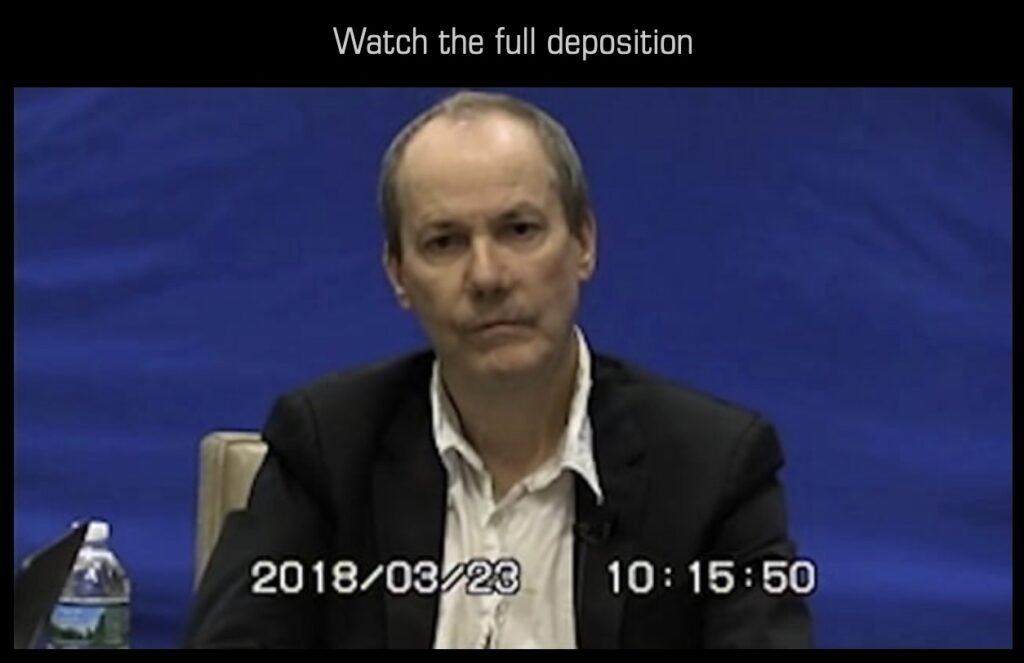
Screenshot from 2023, when Richard Prince’s second deposition was streaming at depositionrow.com
Since Richard Prince’s video recording of his 2018 deposition in the McNatt & Graham lawsuits briefly surfaced online in 2023 until it was screened at Sant’Andrea de Scaphis as a work, Deposition (2025), it feels like the number of people who have watched the full 7-hour thing would not have filled the smallest theater at the Quad Cinema.
If you’re not going to watch it—again, it’s almost seven hours of Richard Prince talking extremely slowly in an adversarial conversation with offscreen lawyers—Russeth’s take and highlights will get you the gist. And the importance.
For me the standout of this second deposition is the extent Prince will go to to maintain an artistic process of freedom and experimentation, almost five decades into his practice. True, it may be the kind of freedom only available to someone making $45 million/year—the tens of thousands of billable dollars per hour represented by a conference room full of the most expensive lawyers in America doesn’t begin to account for the cost incurred to realize this one video work.
But if you’re an artist with the means to re-create the circumstances of your most surprising, innovative moments of creation, wouldn’t you do it? Shouldn’t you?
I saw “2 results for ‘the second deposition of richard prince'”? and then this loaded.
In commemoration of the Roman exhibition of Richard Prince’s Deposition (2025), I present this appropriation, a publication of the unauthorized transcription and accompanying illustration, on a platform of capitalist consolidation.
This softcover version of The Second Deposition of Richard Prince is formatted for easy reading, and includes black and white images of court exhibits being discussed. It also includes a handcrafted index, optimized for art historical and critical discourse.
I’ll have stamped and signed copies available directly, shipping when I get back into my newly militarized town. Or you can buy one or a thousand right now.
Meanwhile, The Deposition of Richard II is a collection of eight late 14th- and early 15th-century Latin texts that chronicle and comment on events that led, in 1399, to the deposition of King Richard II of England and the accession of Henry, Duke of Lancaster, as King Henry IV. David R. Carlson published it with the Pontifical Institute of Medieval Studies in 2007. At present, according to Abebooks, three copies are available in the UK.
“The Latin style matches the occasion: an unfamiliar, idiosyncratic word-set, repetition and extraordinary verbosity, sentences and clauses so long and involved that even the persons responsible for them sometimes lose grammatical way” Not just lawyers’ Latin, in other words, but a form of lawyers’ Latin appropriate to the gravity of the occasion. And there was clearly a point to all this, just as there was to the precision of the language, because, as Carlson goes on, “precise sense might matter; also, verbosity can make a statement more exact; and repetition, besides hedging against the inevitable flaw of manuscript transmission…elevates meaning.”
The context-driven, linguistic specificity is also the key to Prince’s Deposition, where the language and discursive structure belong to lawyers, not artists. That clashes with art and the frameworks used to understand and explain art in unfamiliar ways that are sometimes absurd and sometimes revelatory. There is literally a moment when Prince, in the middle of a long and deep monologue about rephotography, is interrupted by the lawyer saying, “Do you remember the question at this point, sir?”
With Deposition, Prince appropriated the entire legal process for his expressive purposes: he used this formal, ritualized interrogation to talk about his art—and then he turned it into art.
Now I want to translate Prince’s deposition into Latin.
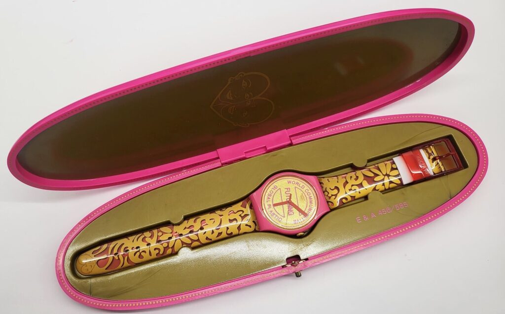
In June 2015, the Berlin-based performance artists Eva & Adele released a Swatch at Okwui Enwezor’s Venice Biennale. It is pink and gold, and is titled Futuring, the artists’ term for “designating a time unfinished, caught up in the process of developing and revealing itself, challenging people to take an active role in shaping their own future. Futuring is also the principle of the artists’ performance, the unquestioned freedom of sexual self-determination that EVA & ADELE themselves represent.” [via]
A numbered, limited edition of 585 was released in Venice, and an unnumbered, unlimited, but otherwise identical version was released everywhere else.
After Adele’s years-long legal battle to have her birth certificate issued in her proper gender, the pair were married in 2011. Eva, the shorter of the two, passed away in May 2025.

![a mostly black on white jasper johns print is a dense composition of recognizable elements from his work in 1992 and before: trompe l'oeil paper prints of barnett newman etchings and a large photo of a spiral galaxy sit on top of an outline traced from the isenheim altarpiece, recognizable as something figural, or copied, but hard to discern. in the lower left corner is his optical illusion vase made from two profiles of, presumably, himself. on top of the galaxy are printed ladder fragments, a silhouette of a small child, the latter in blue, and inside [sic] the vase, three stick figures with brushes are printed in red against the grey gradient interior, hard to pick out. these elements all match up to etching plates from the seasons, a print johns made two years earlier, in 1989-90, so this is a crossover combo of several sets of elemtns, or series of images. a gift of the artist to the walker art center](https://greg.org/wp-content/uploads/2025/08/johns-untitled-little-guys-1992-wac-1024x853.jpeg)